
An accessible website is one that anyone can use: someone using a screen reader, someone who can’t operate a mouse, someone who has difficulty seeing light colors or someone browsing with the sun shining on their phone screen. The good news is that most problems repeat themselves and can be fixed with a few changes. This guide explains the most common web accessibility mistakes and how to fix them, with code examples and real data.
Quick summary
- 94.8% of one million home pages analyzed in 2025 had detectable accessibility failures (WebAIM).
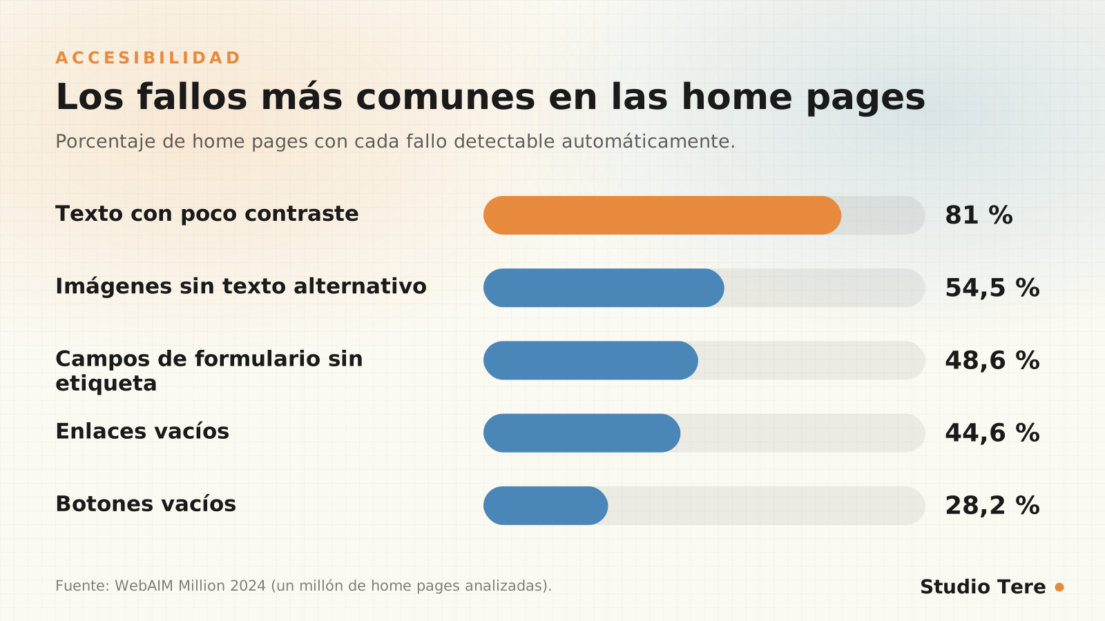
- The five most common failures: low contrast, images without alt text, unlabeled fields, empty links and empty buttons.
- The reference standard is WCAG 2.2, level AA.
- Automated tools only detect part of the problems: test with the keyboard and with a screen reader.
In this article
What web accessibility is and why it matters
The WCAG 2.2 guidelines, from the W3C, organize accessibility around four principles: content must be perceivable, operable, understandable and robust. Level AA is the usual target in practice and in regulation.
It matters for three reasons: you reach more people, you improve the experience for everyone (good contrast and clear buttons help anyone) and, in some markets, it’s a legal obligation. For example, the European Accessibility Act (Directive (EU) 2019/882) has applied since June 28, 2025 and affects e-commerce services aimed at EU consumers, including companies outside Europe. Regulations vary by country: check the ones for your markets.
The data: what WebAIM found across a million pages
The WebAIM Million report analyzes the home page of one million sites every year. In 2025 it found detectable WCAG 2 failures on 94.8% (down from 95.9% in 2024), and low text contrast on 79.1%, the most frequent problem. The 2024 edition details the five most common failures:
A curious fact: according to WebAIM, pages with ARIA (attributes designed to improve accessibility) had on average more than twice as many errors (57) as those that didn’t use it (27). Not because ARIA is bad, but because used without knowledge it makes things worse. The golden rule: use semantic HTML first.
Five common mistakes and how to fix them
1. Low color contrast
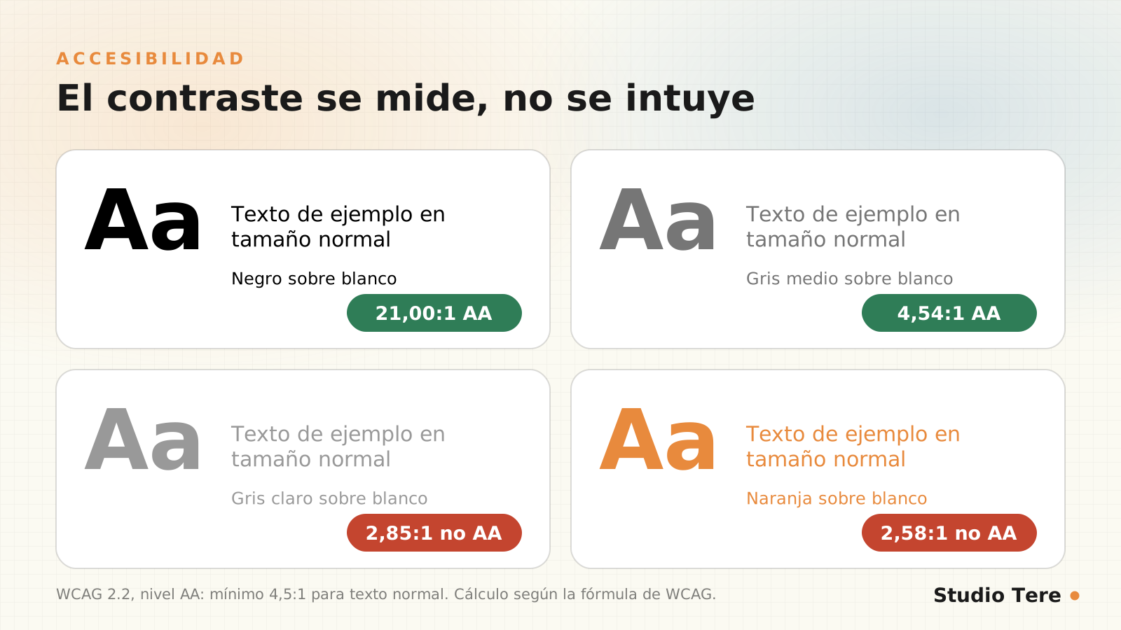
Text must have a contrast ratio of at least 4.5:1 against its background (3:1 for large text). Light gray on white looks elegant, but many people can’t read it. Measure contrast with the WebAIM contrast checker, not by eye.
2. Images without alt text
Alt text describes the image for someone who can’t see it. Decorative images should have it empty so they’re ignored.
<!-- Informativa -->
<img src="grafico.png" alt="Gráfico: el 48 % de los sitios aprueba Core Web Vitals en móvil">

<!-- Decorativa -->
<img src="adorno.png" alt="">
3. Form fields without a label
Every field needs an associated label. Help text inside the field (placeholder) disappears when you type and doesn’t replace the label.
<label for="correo">Correo electrónico</label>
<input id="correo" type="email" name="correo" autocomplete="email" required>
4. Empty links and buttons
An icon with no text says nothing to a screen reader. Add an accessible name, and avoid ambiguous text such as “click here.”
<a href="/contacto/" aria-label="Contactar por WhatsApp">
  <svg aria-hidden="true">...</svg>
</a>

<button type="button" aria-label="Abrir el menú">
  <span aria-hidden="true">☰</span>
</button>
5. Keyboard navigation and invisible focus
Everything that can be done with a mouse must be doable with the keyboard, and the focused element must be visible. Never remove the focus outline without offering an alternative:
/* Un foco claro y visible */
:focus-visible {
  outline: 3px solid #4a86b8;
  outline-offset: 3px;
}
How to test without being an expert
- Test with the keyboard: move through your website with Tab, Shift+Tab, Enter and Esc. Can you reach everything? Can you see where you are?
- Zoom to 200%: content must not break or get lost.
- Use an automated tool such as WAVE or Lighthouse. They detect only part of the problems, so they’re not enough.
- Test with a screen reader (NVDA on Windows, VoiceOver on Mac and iPhone) at least on your key pages.
- Check contrast with a checker, not by eye.

Accessibility in WordPress
- Theme and builder: check that it generates semantic HTML (real headings, lists, buttons and links). We cover this in Etch vs. Gutenberg.
- Headings: one H1 and a logical hierarchy; don’t use them for styling.
- Media library: fill in the alt text when uploading each image.
- Forms: visible labels, clear errors and fields with the right type.
- Skip link to the content and visible focus.
- Brand colors: check that your palette meets contrast requirements before using it for text.
A four-week improvement plan
| Week | Task |
|---|---|
| 1 | Measure with WAVE and Lighthouse; note the failures by template |
| 2 | Fix contrast, alt text and form labels |
| 3 | Fix keyboard navigation, focus and empty links or buttons |
| 4 | Test with a screen reader and repeat the measurement; document |
Frequently asked questions
Is it mandatory for my website to be accessible?
It depends on your country and your sector. In the European Union, the European Accessibility Act applies to many e-commerce services since June 2025. Even without a legal obligation, it’s good practice with clear benefits.
Will an accessibility plugin fix it?
No. They can help with specific adjustments, but they don’t fix contrast, structure or poorly written code. Accessibility is built from design and HTML.
Which WCAG level should I aim for?
WCAG 2.2 level AA is the usual standard and the one regulations tend to require.
Does accessibility affect SEO?
Indirectly, and positively: clear headings, alt text, descriptive links and good structure help both people and search engines.
Where do I start?
With the five mistakes in this guide: contrast, alt text, labels, empty links and buttons, and keyboard focus. They’re the most frequent and the ones that improve the experience the most.
Want a website usable by everyone?
We review your website’s accessibility and deliver a prioritized list of fixes, with concrete examples.