
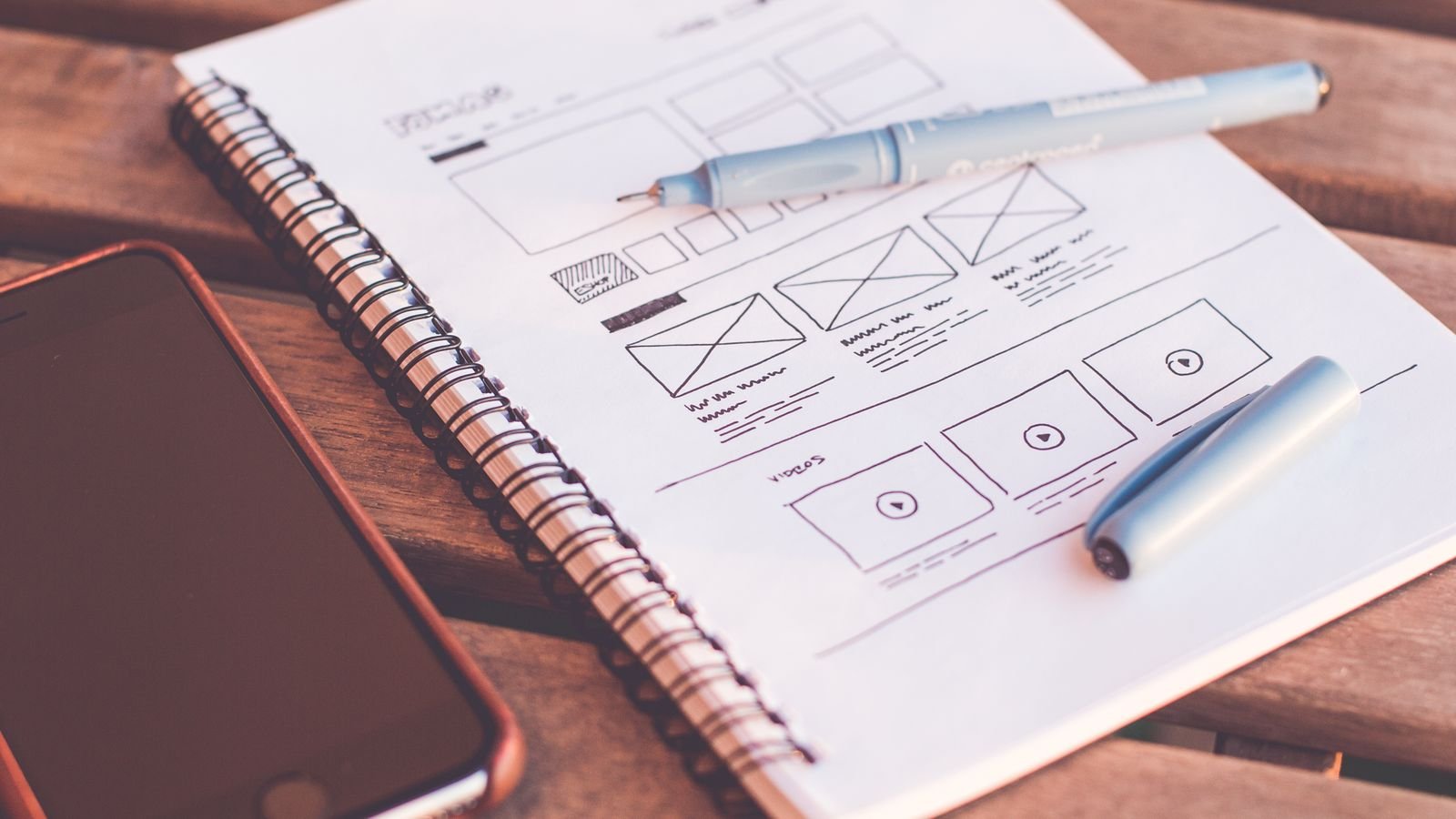
A landing page has a single job: to take a person from curiosity to action. Everything that doesn’t help that goal is surplus. This guide explains the anatomy of a landing page that converts, what the data says increases (and reduces) conversion and how to measure whether it works, with examples from our own landing page.
Quick summary
- A landing page needs a clear promise and a single main action.
- According to Unbounce, the median conversion rate is 6.6%; plain-language copy reaches 11.1% versus 5.3% for college-level copy.
- Mobile speed matters: 53% of visits are abandoned if the page takes longer than three seconds (Google, 2017).
- Real social proof, short forms and frequently asked questions remove doubts.
- Measure, change one thing at a time and don’t draw conclusions from low traffic.
In this article
One promise, one action
The headline should say what the visitor gets and the main button should ask for just one thing. If you offer three different paths (buy, call, subscribe, read the blog), most people won’t choose any. This doesn’t mean hiding other options: a secondary button like “talk to a person” can sit alongside the main one, as long as it doesn’t compete with it.
Anatomy of a landing page that converts
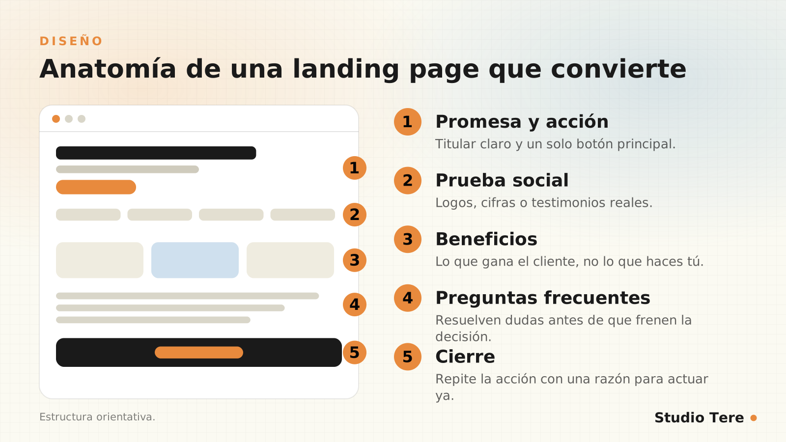
- Promise and action: a clear headline, a supporting sentence and a main button visible without scrolling.
- Social proof: testimonials, client logos, figures or real cases (never made up).
- Benefits: what the customer gains, written from their point of view, not a list of your features.
- Frequently asked questions: they settle the doubts that hold back the decision (price, timelines, what’s included, what happens next).
- Closing: repeat the action with a clear reason to take it now.

Clear writing converts more
Unbounce analyzed more than 41,000 landing pages and 57 million conversions in its Conversion Benchmark Report 2024. Two findings serve as a reference: the median conversion rate across all industries is 6.6%, and copy written at a 5th- to 7th-grade reading level reaches a median of 11.1%, versus 5.3% for college-level copy.
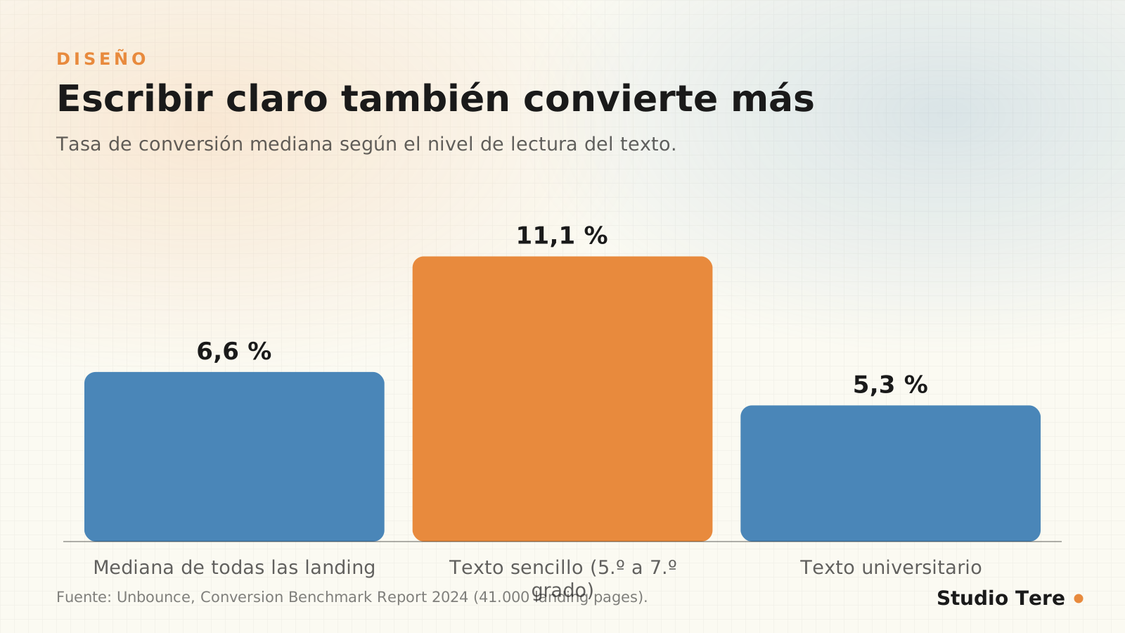
These are medians from a specific dataset, not promises for your page, but the idea is compelling: write so it’s understood the first time. Short sentences, everyday words and one idea per paragraph. If your copy sounds like a corporate brochure, cut it down.
Speed and mobile experience
A slow landing page loses visitors before they read the headline. According to Google, cited in Think with Google, 53% of mobile visits are abandoned if the page takes longer than three seconds to load (a 2017 study, although the behavior still holds). Review images, scripts and fonts with our Core Web Vitals guide and design for mobile first: a visible button, readable text, forms that are comfortable to use with a thumb.
Forms: ask only for what’s necessary
- Every extra field is one more reason to leave: ask only for what’s essential for the first contact.
- Use visible labels and clear error messages (accessibility).
- Offer an alternative path, such as WhatsApp, for people who don’t want to fill in anything (how to connect it).
- Explain what happens next: when you’ll reply and what the person will receive.
Social proof with judgment
A specific testimonial, with a name and a result, is worth more than ten adjectives. And if you can show it on video and link to the client’s website, even better, because anyone can verify it. Rules: ask permission, don’t make them up or exaggerate them, and keep them updated. Fake social proof destroys the trust you wanted to build.
Nobody buys because of what you say about yourself, but because of what others say about what you did for them.
Conversion principle
Measure and test without fooling yourself
- Define the conversion before publishing: form submission, WhatsApp click, purchase.
- Change one thing at a time, or you won’t know what worked.
- Wait until you have enough traffic: with few visits, an A/B test only measures noise.
- Compare by source: traffic from an email and from an ad don’t behave the same way.
- Look at quality, not just the quantity of leads.
A real example: the S@Y Digital landing page
Our own landing page, S@Y Digital, follows these principles. A quick review, in case it works as a model for you:
- Promise: the headline says what you get (a professional website) and what it amounts to per day (less than 1 USD), on the first screen.
- Key facts in labels: real value, offer price, number of pages and no lock-in.
- One main action (sign up) and one secondary (talk to a person), clearly differentiated.
- Social proof on video: two client testimonials with links to their websites.
- Immediate contact: a floating WhatsApp button that’s always visible.
Final checklist before publishing
- Is the offer understood in five seconds?
- Is there one main action, visible without scrolling on mobile?
- Does it load in under three seconds on a normal connection?
- Is the text easy to read and free of jargon?
- Is the social proof real and verifiable?
- Does the form ask only for what’s necessary?
- Is conversion tracking set up?
- Does it work with a keyboard and have good contrast?
Frequently asked questions
What is a good conversion rate?
It depends on the industry, the traffic source and the action. Unbounce’s median is 6.6%, but it varies a lot (SaaS is around 3.8%). Your best reference is your own history.
How long should a landing page be?
As long as it needs to be to settle the doubts: some simple pages are fine with one screen, and others with more complex offers need several sections. Prioritize clarity over length.
Is it better to have a landing page or a service page?
A landing page is for a specific campaign, with a single action and no distractions. A service page is built into your website and works over the long term.
How many visits do I need for an A/B test?
Enough that the difference isn’t noise; with low traffic, it’s better to improve with judgment and check against data over time.
Should I add a countdown timer?
Only if the deadline is real. Artificial urgency shows and reduces trust.
Need a landing page that really converts?
We design campaign pages that are fast, clear and measurable, with the structure that best fits your offer.
Sources and recommended reading